eight o’clock


Fall / 2021
KIND: packaging re-design
RECOGNITION: Graphic Design USA American Packaging Design Award (2023)
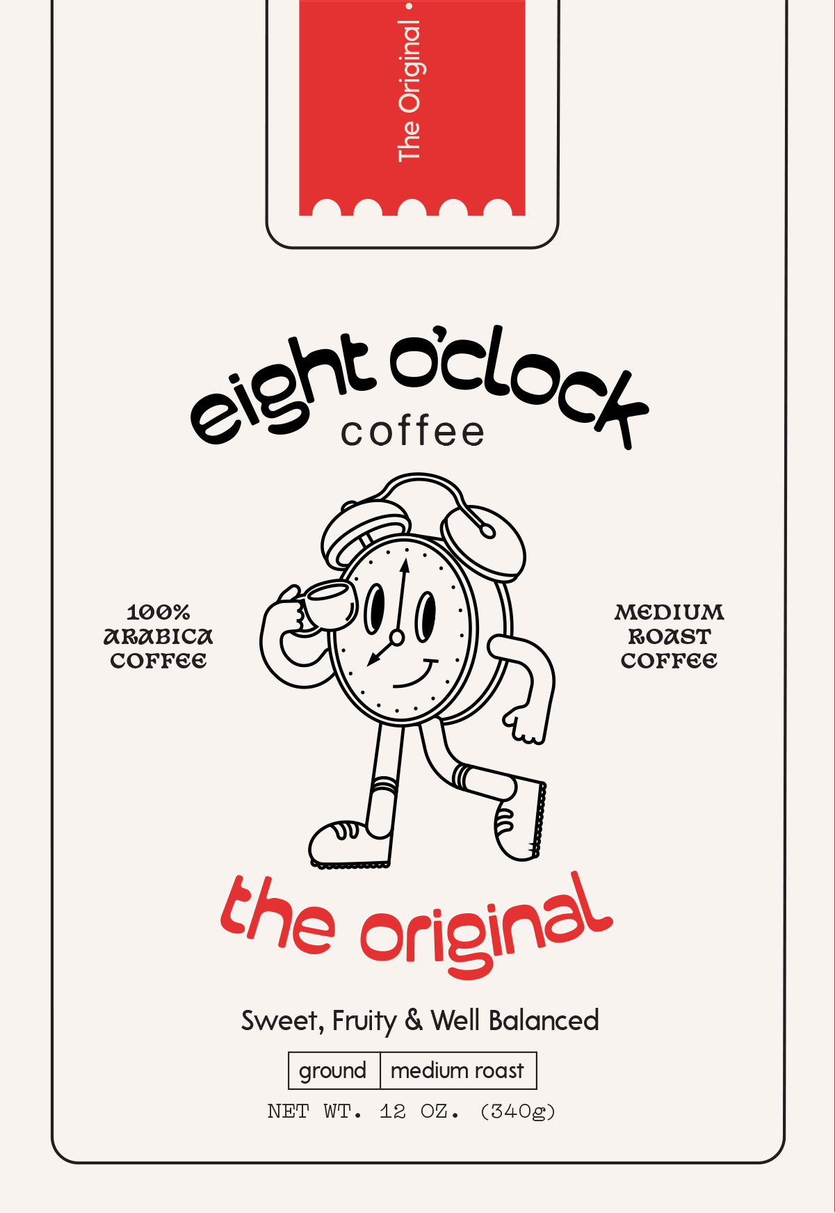
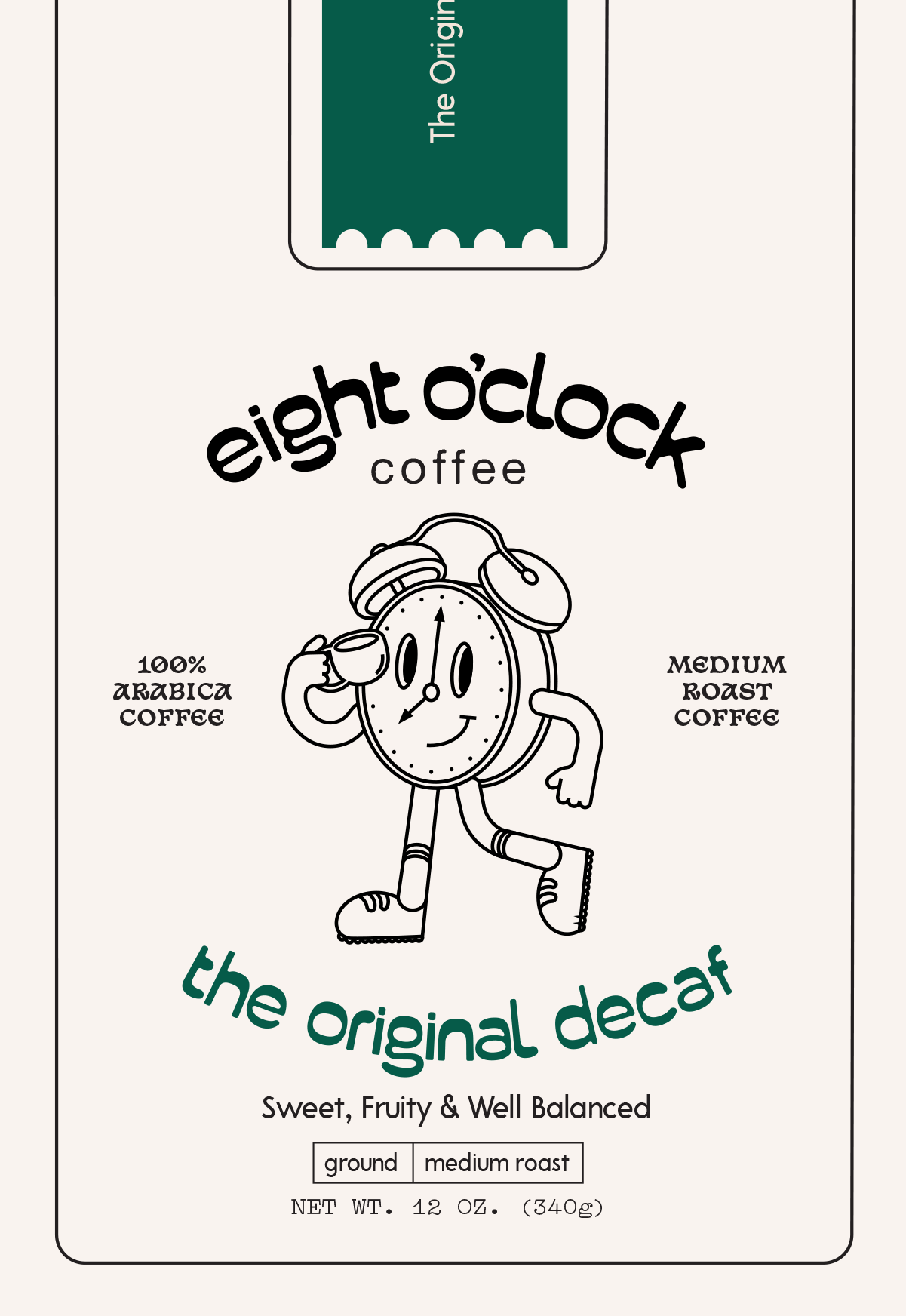
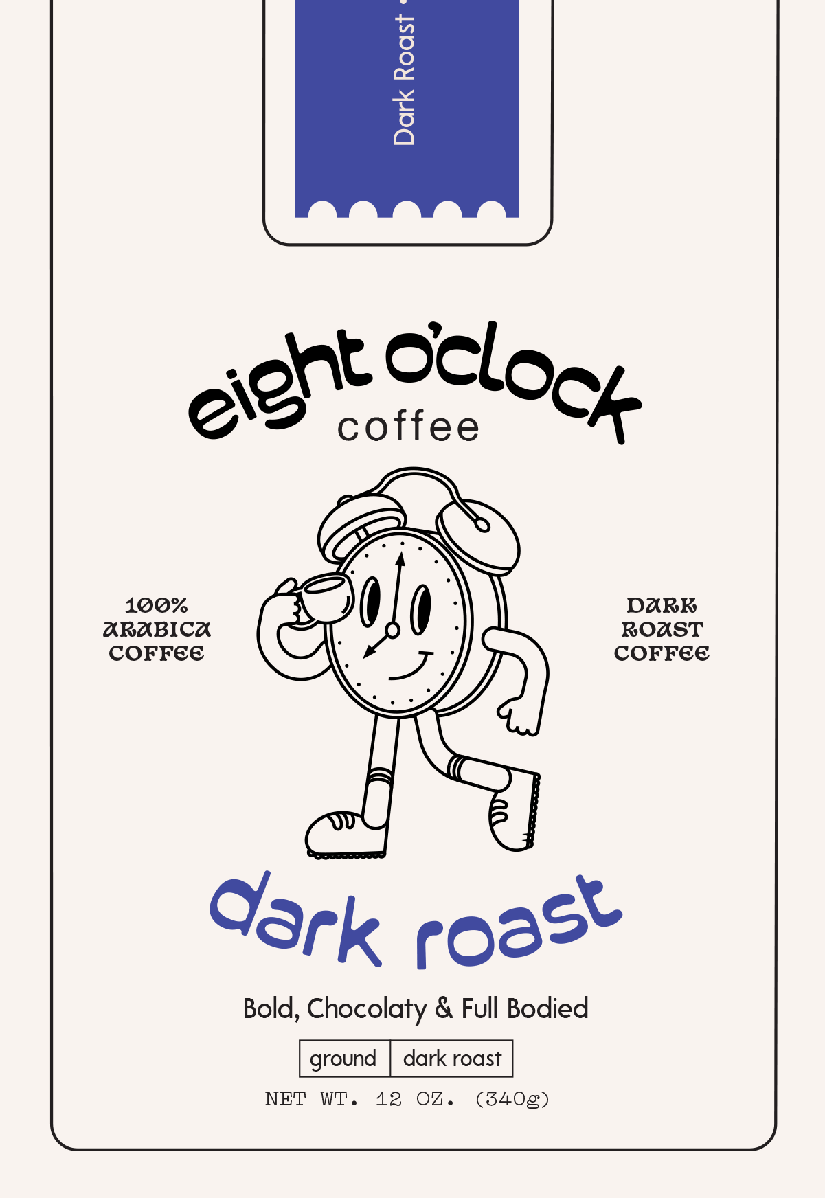
The redesign of Eight O’clock Coffee was done with the goal of giving the packaging a much needed refresh, while also keeping intact the already established spirit of the brand. To give the packaging a bit of character and sense of playfulness, I illustrated the Clock character, serving as the center element on the coffee bag. Paired with a more playful typeface, the design evokes a more inviting and whimsical impression as opposed to the original packaging.
The same vibrant red that was used in the original packaging was utilized in the re-design, but in a much more limited scope. The color is confined to the sides of the packaging as well as the taped closure across the top in order to keep the simplicity and neatness of the design. These new elements were utilized in hopes of creating a more enhanced and modernized semblance of the packaging.
 original
 decaf
decaf french vanilla
 dark roast

