Marmot
Spring / 2023
KIND: branding / packaging design
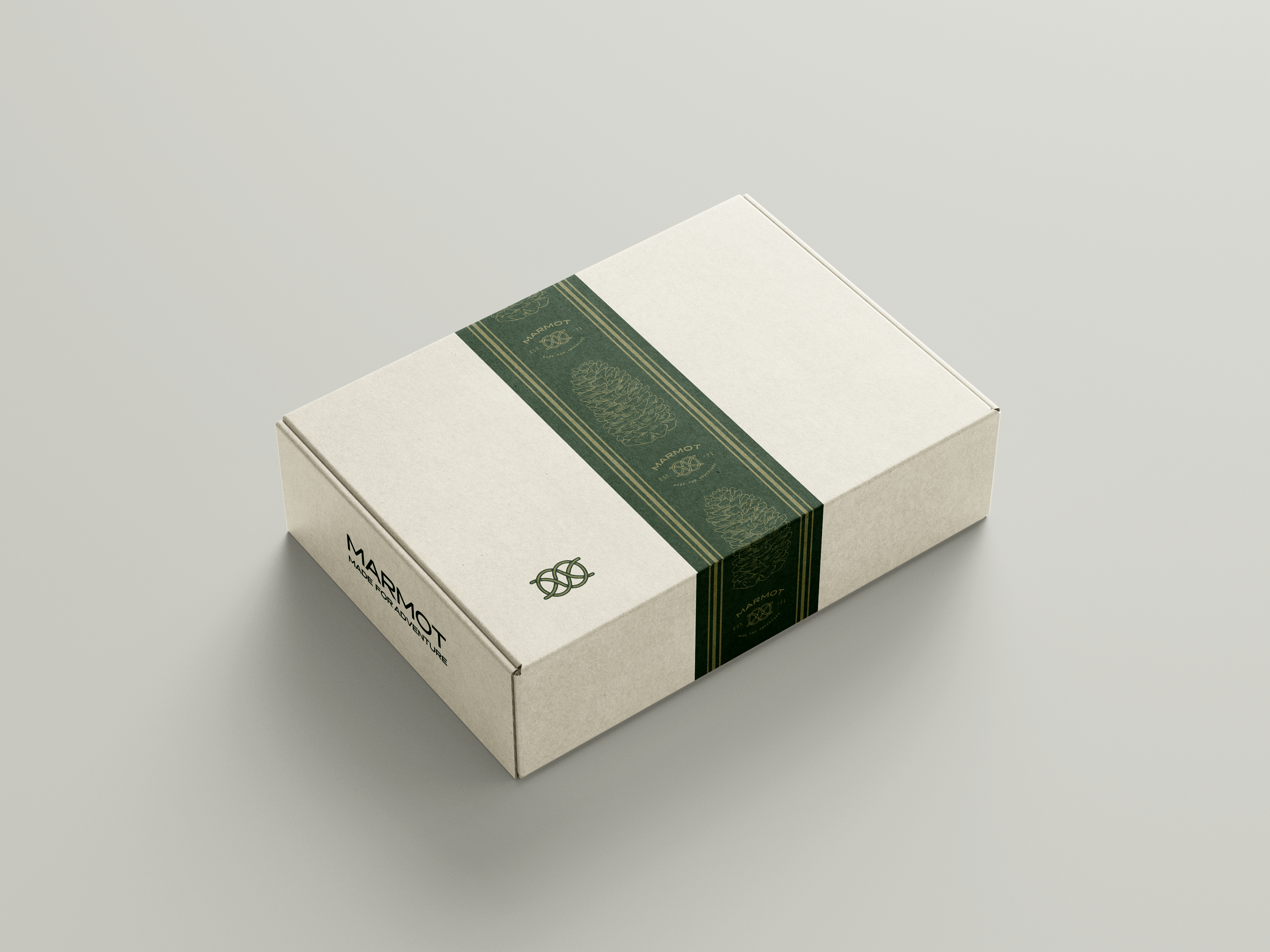
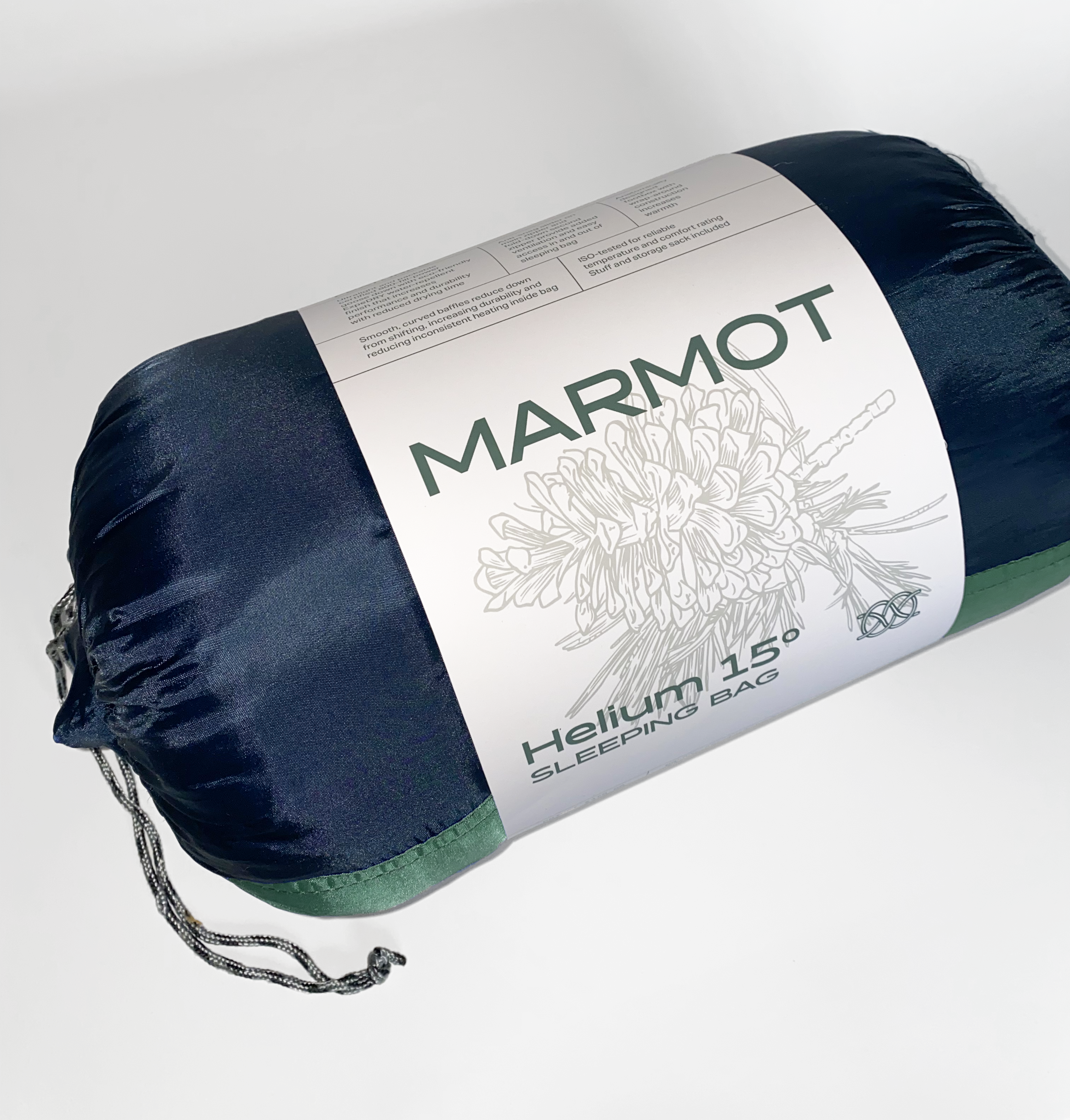
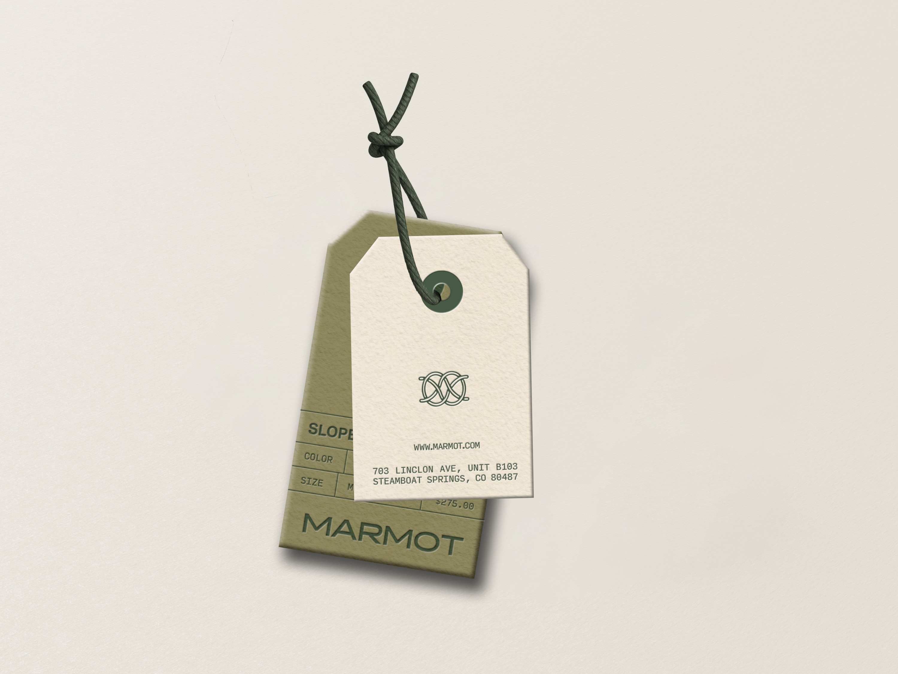
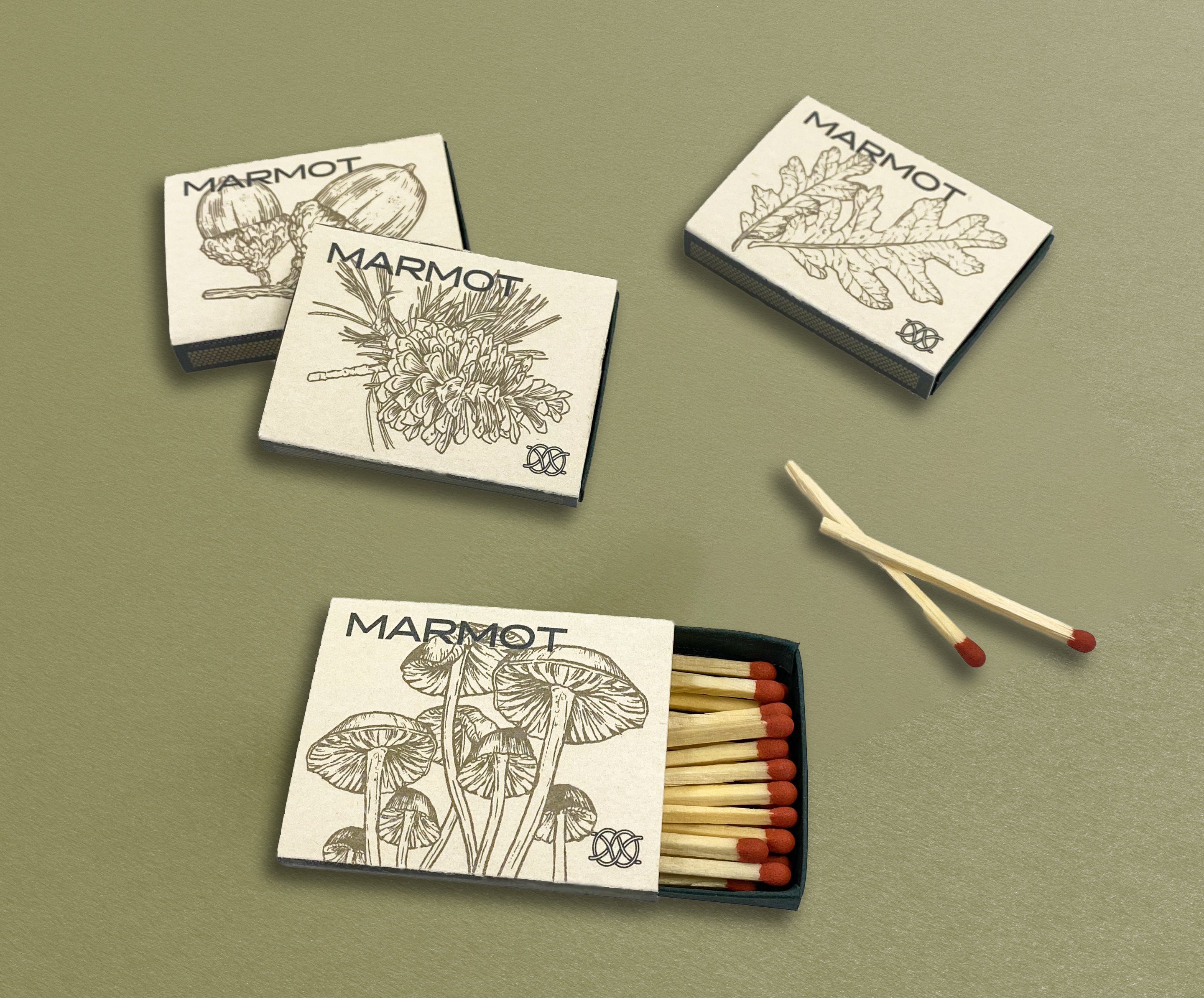
Marmot is a branding project that was expanded from a simple trademark into a full branding identity system. The full set of stationary includes three business card variations, a mailing envelope, order form, letterhead, and mailer carton. Beyond just office documents, the branding is implemented on signage, matchboxes, a sleeping bag belly band, and product tags.

primary logotype
The branding identity system for Marmot begins with the trademark. The mark itself is representative of rope in the form of a Carrick Bend, or “Pretzel knot,” which relates to the overall outdoor theme of Marmot as a brand. It is an essential part of Marmot’s branding and identity, and can be utilized in numerous ways when applied to Marmot products. The logptype pairs both the trademark and the brand’s name in the typeface Halogen, which is utilized across packaging and stationary.

stationary
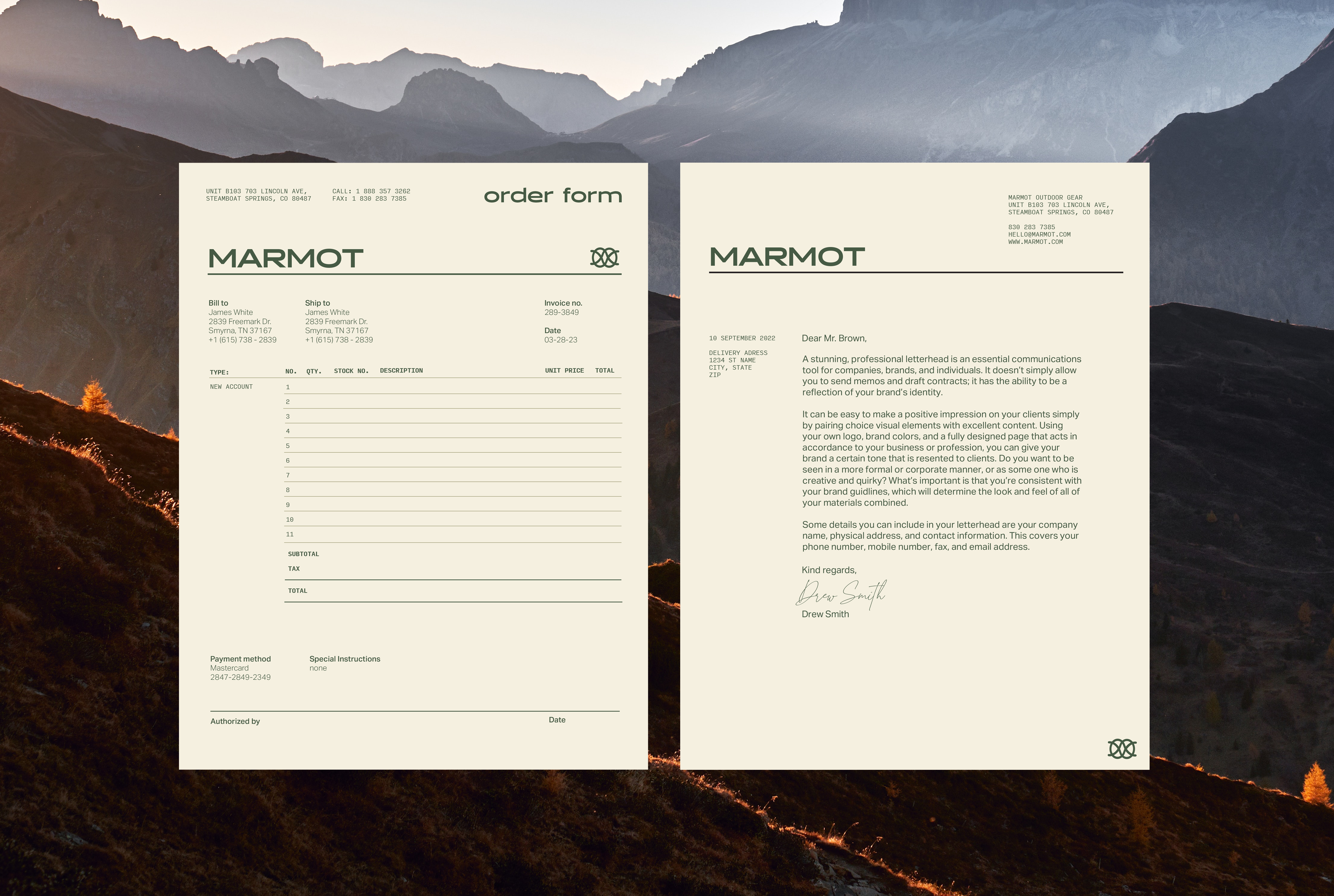
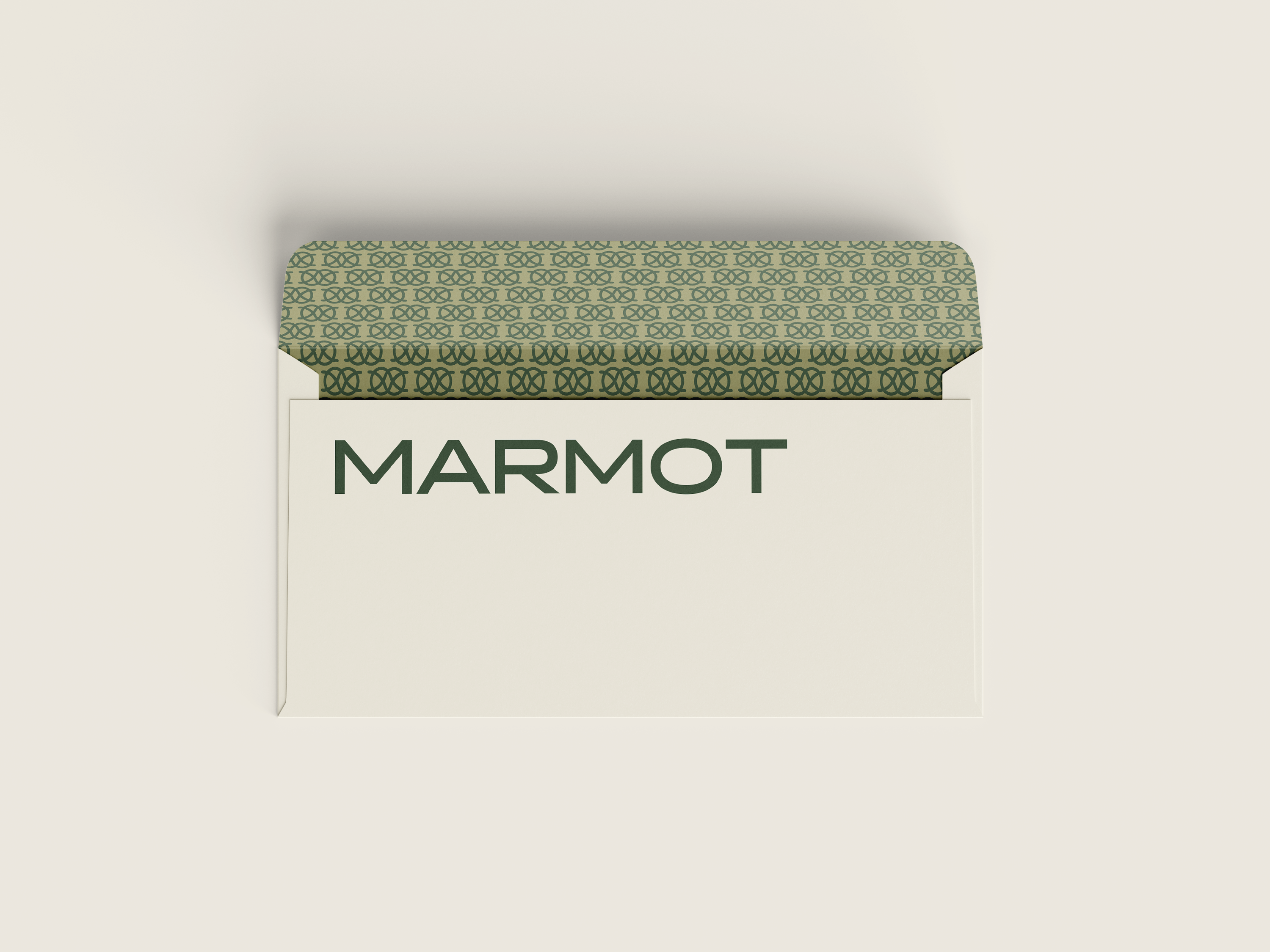
Marmot’s stationary consists of three different business card designs, an order form, letterhead, and envelope.

BUSINESS CARDS
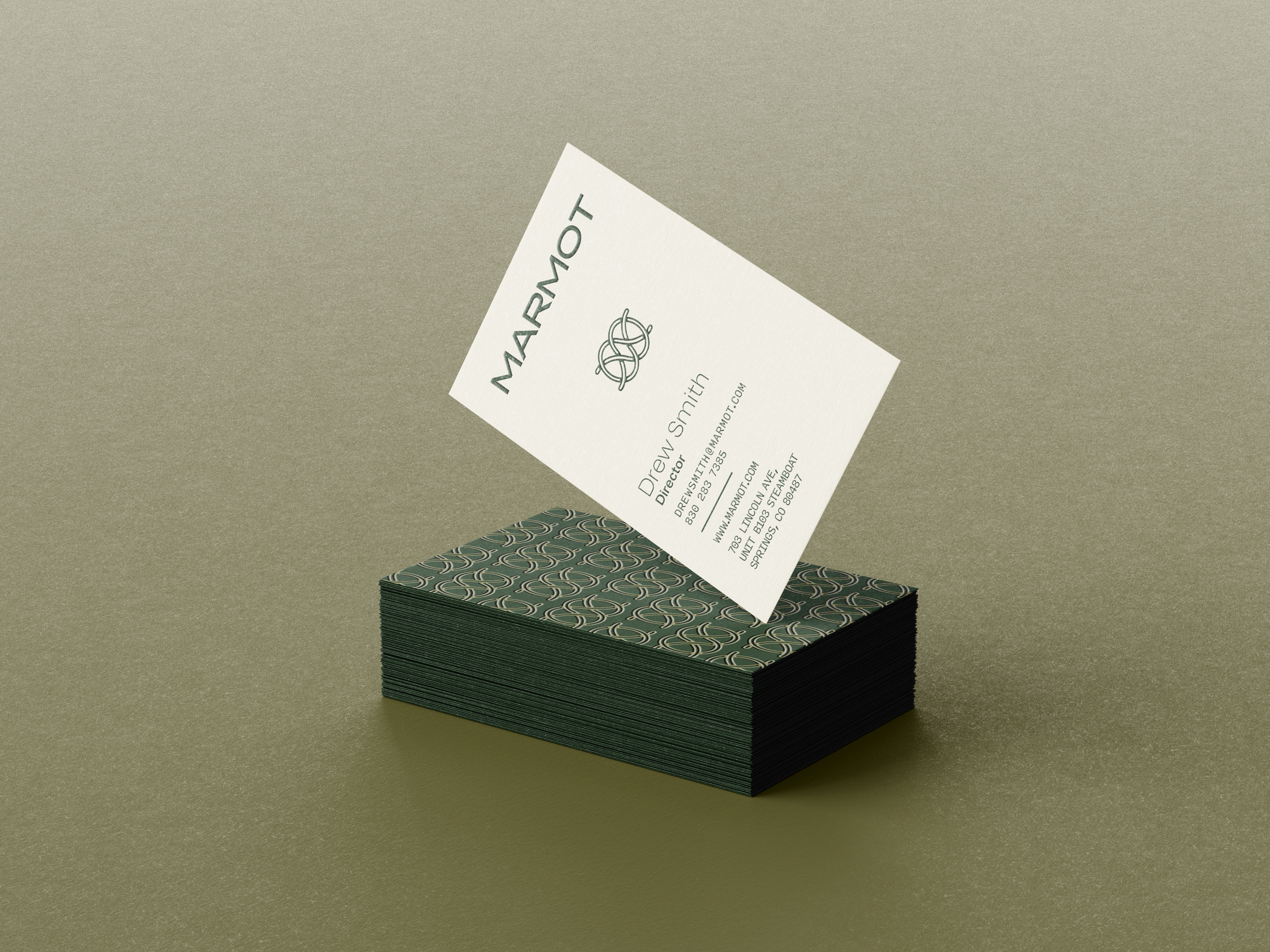
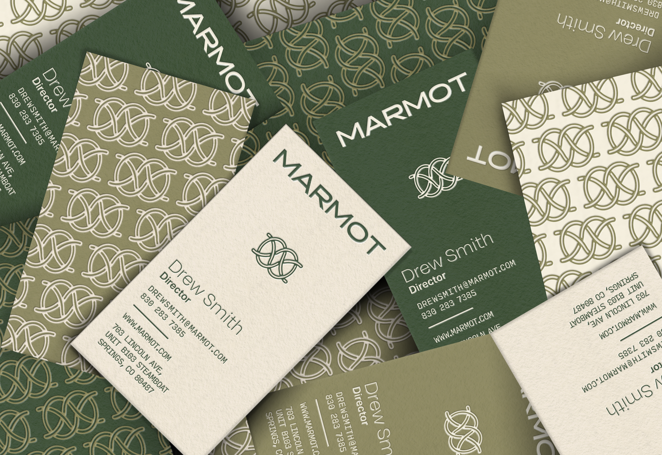
(front) The front of each card features The company name and standard logo, followed by the name, and position set in 15pt Aktiv Grotesk and 8pt Aktiv Grotesk Bold. Directly below, the contact information and company details are shown in 7pt Input Mono.
(back) A repeated pattern of the standard Marmot logo in various system colors are used in three different options for the back of the cards. The acceptable color combinations must be used for these patterns.

application


